Introduction
The Zen of Python states that:
“There should be one– and preferably only one –obvious way to do it.”
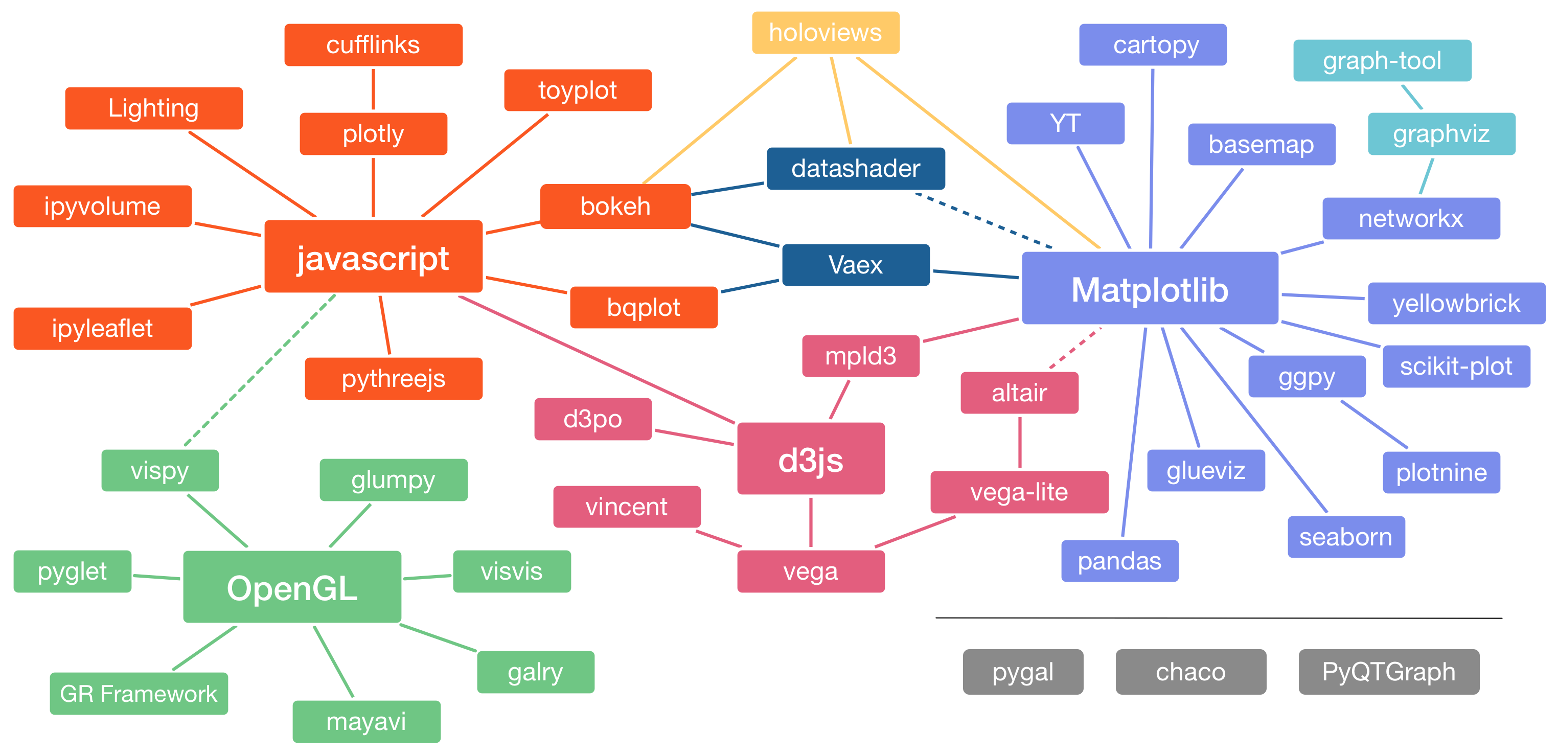
The Python visualization landscape shown above doesn’t quite live up to this mantra. While R users have a clear standard for interactive data visualization and dashboarding with ggplot2 and Shiny, Pythonista’s are spoiled for choice.
Upon closer inspection, however, one could argue that the library that supports your thinking as a data scientist, is the best one to use in your data science project. So if we were to choose a library specifically for the purpose of Exploratory Data Analysis (EDA) and presenting the results from a data science project in an interactive document (dashboard, app), which one would it be? And why?
These questions are adressed in the following two lectures, which introduce Altair and the underlying grammar of interactive graphics from Vega and Vega-Lite.
The term Exploratory Data Analysis (EDA) is mostly attributed to Tukey (1977). In EDA, one’s aim is not to draw conclusions on predefined research questions (be it the construction of a model, the estimation of parameters, or the confirmation or rejection of a hypothesis); in fact, EDA in problem solving is often applied to data collected without well-defined hypotheses. In EDA, one screens the data for clues that could inspire ideas and hypotheses.
Read the paper by de Mast & Kemper (2009) to understand what the purpose of EDA and how it fits in the context of a data science project.